Friday, September 27, 2013

Glitz Design Blog Hop!


Hello! Thank you for stopping by my blog. I hope you have enjoyed the inspiration from our lovely design team ladies this far.

 Let's jump right in to the good stuff. I am very excited to share my page using the Wild & Free Collection from Glitz Design.


 Products: 
Wild & Free Full Kit
Hello Friend Element Pack 1

 I can not get enough of this kit, there are so many little bits hiding in the files that just add a little bit of pizazz. If you are new to using digital stamps, try playing around with the blending modes of the layer to get a whole new effect, you might be surprised at how just a little tweaking can add a lot of WOW factor to your pages.

 If you are following along with the blog hop, remember to leave one comment on each blog! One lucky comment from all of the blogs will win a full Wild & Free digital kit. Winners will be announced on the Glitz Blog on Sunday afternoon. 

Your next stop is the Glitz Design Blog >>>>

Wednesday, September 25, 2013

Peppermint Creative: Scraplift Challenge Accepted!


 Have you seen? Miss Mint has sent out a challenge! To help get back in the scrappy swing of things, the ladies over in the GET MINTY| Peppermint Creative Facebook Group  have been searching the gallery for Mint Chick pages to lift, adding their own twist on it and then posting in the group.

 Scrap-lifting is a great way to get Stella back in her illusive groove. Since most of the time consuming part of creating the layout design is already done for you, you are able to focus on the fun extra bits and embellishments. And really, don't we love anything that takes some of the time out of scrapping?

 If you are new to digital scrapbooking, you may not be familiar with this term 'scraplift'. It isn't as scary as it sounds, I promise. A scrap lift is taking an existing page and borrowing ideas or design principles for your own page design. It can be exactly the same as the original page, or you can mix it up a bit and just use it as a starting off point to get a basic layout started. The choice is yours. Sometimes I find myself getting stuck trying to follow the original layout too closely, that can cause far more issues than are needed, don't be afraid to adjust the lifted page to make it more personal or more in line with your style.

 I found this page by Shutterspeed (Sarah H.) just sitting in the gallery waiting to be lifted. I think she was able to get just the perfect amount of asymmetrical balance with the stitching clusters along the sides and I instantly fell in love with her title work. Clean, simple, with a dash of funk. It is perfect.


 In Sarah's page, the monotone color scheme really makes the contrast in the photos pop, I did try to re-create this look, but ended up not liking how my photos looked in black and white. This is where adjusting to fit your style comes in. I could have picked three different photos that would have worked in B&W, however I had a very specific page in mind and didn't want to go digging through my hard drive again looking for more images. To adjust for this, I decided to change the color scheme, still trying to keep the contrast in the papers and elements on the same level as in the original, but using color to balance out the color in the photos.
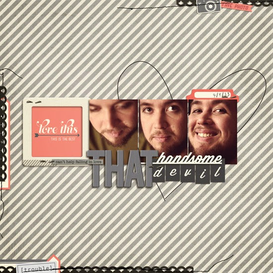

I am very pleased with how it came out. I believe I was able to get a similar feeling and yet keeping it in my own style. I was even able to use some of the very same elements Sarah had picked, and still have a very different page in the end. Don't let the lift become a box for having to make your page exactly the same as the original or think that you have to use completely different elements to get a different end result, you can tweak as much or as little as you like and have a beautiful finished page.

Product list for this page:
He Loves Kit
My Guy LIP Edition
Machine Stitch v.1


If you are interested in joining along for the fun, please click HERE, and you will be redirected to the GET MINTY| Peppermint Creative Facebook group!

Also, if you would like to shop around Peppermint Creative for more of these amazing products, please click HERE

I hope to see you crafting soon!


Monday, September 16, 2013

Design Team Spotlight: Glitz Design- Digital Team

 Oh yes, my most recent team addition. I was completely unaware that Glitz had a digital line until I was contacted about joining the newly formed team. If you watch as many YouTube videos as I do, then you may have seen some of their paper products in The Adventures of Glitter Girl. Digi lovers rejoice, there are now digital products available here: Jessica Sprague's store . Since this is a recently acquired spot, I don't have many pages done but I just had to throw the newest pages together in a post.  I plan on doing a follow up post with a few other pages once I've had a little more time with these incredibly creative products.


 Hello Beautiful using Cashmere Dame.

Sometimes I Get Carried Away using Yours Truly

Indie Dock using Uncharted Waters.

If you are interested in checking out the other crazy awesome products by Glitz Designs, please click here: Glitz Digital Shop.

Thank you for stopping by! I hope you have a very creative day!

Design Team Spotlight: Sweet Caroline Studios, Celeste Knight

 One of my newer creative teams, Sweet Caroline has pushed my scrapping limits a bit. Celeste tends to lean more towards bright colors with a dash of bold pattern papers. I instantly fell in love with her amazing stamps, I love tucking them in the background and playing with the blending modes.
 However, it took me a few tries to figure out how to use her products in a way that worked with my style. Once I realized how incredible more simple layouts work with her creations, I was on a roll. I had simply been over thinking my process and found that when I just open up the kit and start putting things on a canvas, they turn out much more to my liking. I have picked a few pages I am most proud of, all using Sweet Caroline Studios products.

Odd One using Go Getter Paper Pack.

  Love using Celeste's part of the Free Love Collab {no longer available}

 He La using Sliver Lining Part 1.


If you would like to visit Celeste Knight's store, please click this link: Celeste Knight of Sweet Caroline Studios. Thank you for stopping by, I hope you have gained a little inspiration. Good luck in your scrapping adventures!

Sunday, September 15, 2013

Design Team Spotlight: Peppermint Creative

Oh Miss Mint, you do know how to rock some scrappy awesomeness. I have been working with the Minties for almost a year now and couldn't be more pleased with the pages that have come out of the collaboration. With a huge variety of scrapbooking supplies, you can always find a little somethin' somethin' to fit your particular project needs. Project Life-r's rest assured, she's got you covered, here it's called Life In Pictures. The focus is more on square photo shapes and they are absolutely perfect for Instagram-esque photos and layouts. You can see an example in Georgetown, the first layout featured in this post.  Some of my favorite stitching can be found here as well, Machine Stitch Volume 1, Volume 2, and Volume 3.  I just adore that messy but still readable look.  Below you will find my most favorite pages created using Miss Mint's creations and links to the main product used.


Georgetown using Funktography IntsaBundle.

Dandelion Heart using Modern Momma LIP Kit.

Fabulous using Miso Lucky.

These Shoes using Labels & Tags v.01

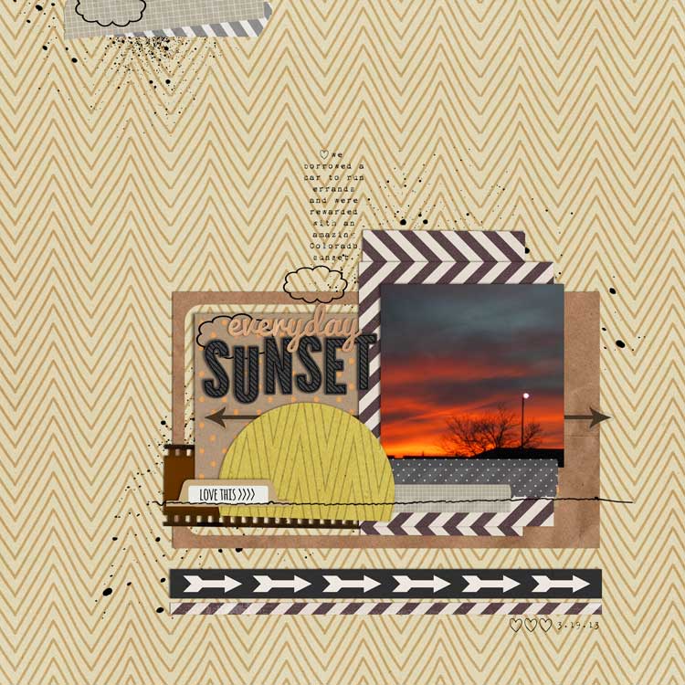
Everyday Sunset using Miso Lucky. 
Amy Tan scrap-lift.

School Snapshots using LIP Cards: Class Education.

I hope these pages have inspired you to make something beautiful! If you would like to shop around Miss Mint's store, please click this link: Peppermint Creative

Thank you for checking out this post!


Design Team Highlights: Digital Design Essentials

Early in my scrapbooking career, I applied to work with Gina at DDE. Being my very first Creative Team, I had no idea what to expect. I was lucky enough to get on a fantastic team with an incredibly talented designer (and lady) from the get go who walked me through the sometimes overwhelming process of uploading, downloading, tagging, commenting and sharing. Over the past two years I have created many, many.. many pages using the products over at Digital Design Essentials. She has a clean and simple style that can work for just about project. Below are a few of my favorite pages using Gina's goodies and links to all the great items used.  From oldest to newest, the Good Eats collection is brand new and honestly, just really great.

If you are interested in visiting her store please do so by clicking this link: Digital Design Essentials.

Additionally, if you have any questions about the pages, feel free to ask!


 Nana's House using Happiness Lives Here.

Fave Photo using Besties Collection.
Funny side note: This collection was made based on L.A. and I, we are best friends and cousins and both create for Gina. 

 Puppy Love using Everyday Life Kit.

This Is My Everyday using Happy Place.

Snow Flurries using Kraftastic Paper Pack & Folded Snowflakes.

Linger using Good Eats Collection

I hope you have gained a little inspiration from some of my favorite personal pages. Look out for future posts featuring the other teams I belong too. 

Have a super fantastic day! 

Monday, September 9, 2013

Iffy's Favorite Free Fonts: Fillable Edition

Fillable [/fil ˈābəl/]
A font with multiple styles that may be stacked upon each other to achieve different finished looks.
                                                                            -Iffy's Made Up Definitions


  Yes, I know, this is not a real thing, but in scrapbooking we kind of make it up as we go don't we? For the second edition of Iffy's Favorite Free Fonts, I wanted to give you options. All of these fonts can be layered together to create personalized wordart that matches any layout or theme.

 Sample Photo of Flatbread Font
  It might be a little confusing if you aren't familiar with masking or clipping in Photoshop. I recommend this video: Put an Image Into Text as it shows the easiest way to add digital paper to text. For those who are familiar with the process of combining layers, it is just a matter of getting each layer lined up the way you want, however by using the Character toolbar you can easy adjust the distance between letters so they behave like nice little fonts and not the neighbors kids
 
  
If you would like to download any of these fonts, please click here: Iffy's Favorite Free Fonts:Fillable Edition and scroll to the bottom of the post.

Iffy's Favorite Free Fonts: Title Edition

Hello there!
 Welcome to the newly minted Iffy Creates blog area of the magic interwebs. If you are thinking to yourself.. 'haven't I seen this before?' and you have recently visited Sweet Caroline Studio's blogspace, then yes. Yes, you have.

 In order to help those who may be interested get to know my process a little better, I have created this nifty little blog. Since this is my first post I thought it only appropriate to share with you my first Iffy's Favorite Free Fonts post.  This post originally appeared on July 23, 2013 and started light Pinterest circulation.

 I started collecting fonts while in Design school, before digital scrapbooking was ever introduced to me. I didn't actually have a plan for them, so they sat lonely and desperate for attention for years. Little did I know, I would be thanking my younger self for having such amazing accidental foresight.  Now they have a purpose.

 In this collection, I wanted to highlight my favorite page title fonts. Finding that ever so perfect text to compliment the page, for me, is not always easy. My usual problem is they either don't look so hot when enlarged or just need a little more oomph, some jazz hands, if you will. I picked these 20 fonts because I feel like they have just that, little top hats and canes for a proper song montage. When enlarged, they are clear and retain their quality, so you avoid that three-drink-in blurriness.

Best of all, they are all free! Some have an option to donate to the creators or purchase commercial use licenses, if you enjoy using them I highly recommend supporting the creators so that they may continue to give us cheap, high quality fonts.    

 
  If you are interested in downloading any of the above fonts, please click here: Iffy's Favorite Free Fonts: Title Edition and scroll to the bottom of the post.

Thank you for reading!